You do not need a complicated brand exercise to get the basics right. Be clear about your business, make a few considered design choices and use them consistently.
- Keep what customers recognise
- Write down a few useful rules
- Apply them to everyday materials
Be clear about the business
Start with who you help, the services you provide and the reasons customers choose you. This gives the design and messaging a useful direction. The aim is to communicate the actual business clearly rather than build an identity around vague promises.
Think about the questions a new customer asks and what they need to feel confident before getting in touch.
Write down who your best customers are, what they ask you for and why they choose you. “Reliable repairs for busy local households” gives you more direction than “innovative solutions”.
Create a recognisable identity
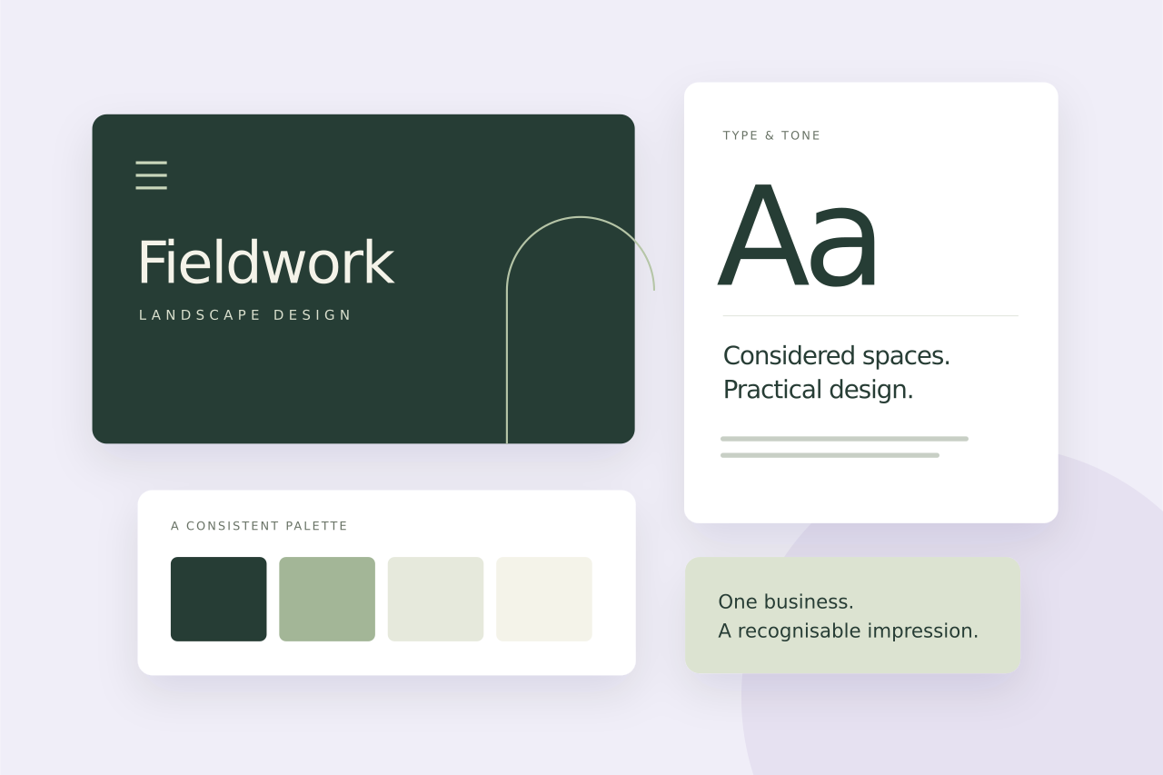
A useful identity includes a clear logo, a considered set of colours and a small selection of typefaces. Check that the logo works in the places you use it: on your website, in a proposal, in an email and at a small size.
An established business may need refinement rather than a completely new logo. Keep elements that customers already recognise when they still suit the business.
Choose heading and body styles that stay easy to read.
Record the colour values, including readable text combinations.
Use a consistent style that shows the work you actually do.
Make the everyday materials consistent
Write down the basics so they are easy to repeat: logo versions, colours, typography, image style and a few examples of how to apply them. Practical guidelines should help you make decisions without redesigning every document.
A short reference can be especially useful when different people prepare social posts, sales presentations or printed materials. The website and those materials should feel like the same business.
A short document with approved logo files, colour values, fonts and a few examples is a better starting point than a large presentation nobody opens. Include a proposal or social post template your team can actually reuse.
Apply the identity where customers meet you
Prioritise the touchpoints that matter to your customers. A service business may need a clear website, a strong proposal template and consistent presentation materials more than a large collection of decorative brand assets.
Review the wording as well as the visuals. Your services, tone and contact details should remain consistent wherever a potential client encounters you.
Check your business as a customer would
- Open your website, a recent proposal and your social profile side by side.
- Check whether the service descriptions and contact details agree.
- Look for inconsistent logos, colours, image styles and tone.
- Fix the materials customers see most often first.
Put it into practice
Explore selected website and brand case studies to see how a clear visual identity works across a website and supporting materials.
A consistent brand beyond the website
For The Travelling Hands, the work included a refreshed website, brand guidelines and templates for presentations and social content, all reflecting their place in the luxury events market.
See The Travelling Hands project
Written by Max Saidi
I design and look after websites for businesses across the UK. These guides cover the decisions that make a website clearer, more useful and easier to manage.
More about Max