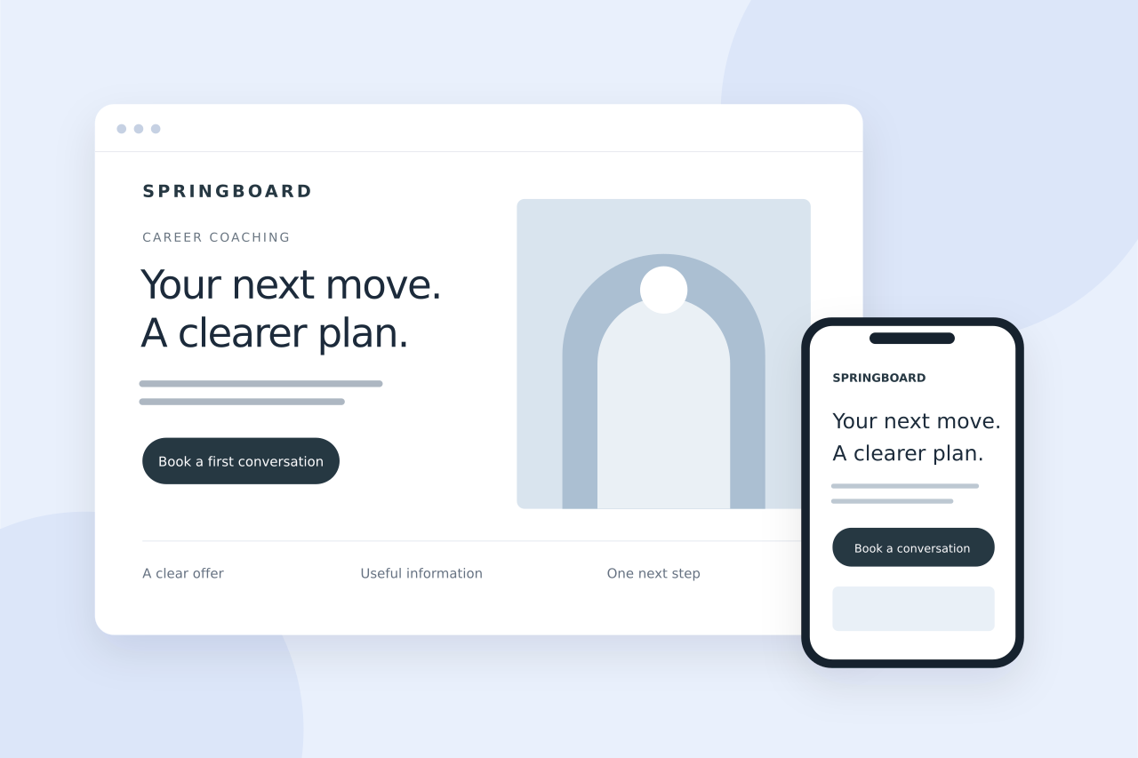
Give one offer a clear destination. Explain who it helps, answer the questions that hold people back and make the next step easy to take.
- One page, one main offer
- Clear words before clever words
- Check the whole journey on a phone
Keep the page focused
Start with one service, product or campaign. Match the page to the message that brought the visitor there, whether that was an advert, an email or a social post. A person who clicks for a specific offer should not have to search your whole website to find it.
Remove competing offers that interrupt that decision. Supporting links can still be useful, but keep the main action easy to identify.
Finish this sentence before you design anything: “This page is for ___, who need ___, and the next step is ___.” If it has three different answers, narrow the page down.
Write a headline people understand
Explain the offer in ordinary language. Name the problem it addresses or the useful outcome it provides. A clear, specific headline is more useful than a broad promise that could describe almost any business.
Use the supporting paragraph to explain who the offer is for and what happens next. Avoid claims about results that you cannot substantiate.
Helping you become your best self.
Personal training in Chesham, built around your week.
Illustrative wording: the second version explains the service and location straight away.
Answer the questions behind the decision
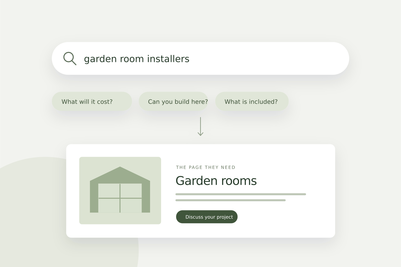
Show what is included, how the service works and any important limits. Use genuine customer comments or relevant examples where you have permission to publish them. If visitors need to ask the same basic questions before enquiring, the page probably needs clearer information.
Keep paragraphs short and group related details under useful headings. Give important practical information, such as price context or availability, an obvious place.
Give visitors a clear next step
Choose an action that fits the offer: request a quote, book a consultation, buy a product or ask a question. Button text should describe that action. Keep forms proportionate to the information you need to respond.
Repeat the same primary action at useful points on a longer page. Different buttons should support the same decision rather than send visitors in competing directions.
“Get a quote”, “Book your first session” or “Check availability” tells people what to expect. Follow it with a short explanation if the next step needs one.
Check the mobile experience
Read the page on a phone. Check the headline, line lengths, image crops, navigation and form fields. Buttons need enough room to use comfortably, and the page should explain the offer without relying on a desktop layout.
Test the complete journey, including confirmation messages and the destination of booking or payment links. A good-looking page still needs to work reliably.
A five-minute check before you launch
- Can somebody explain the offer after reading the opening section?
- Are the main questions answered before the final button?
- Does the form ask only for information you actually need?
- Have you submitted a test enquiry and checked the reply?
Put it into practice
If you have one offer that needs a clearer destination, explore sales page design. A focused page can be added to an existing marketing plan or used as the starting point for a new campaign.

Written by Max Saidi
I design and look after websites for businesses across the UK. These guides cover the decisions that make a website clearer, more useful and easier to manage.
More about Max