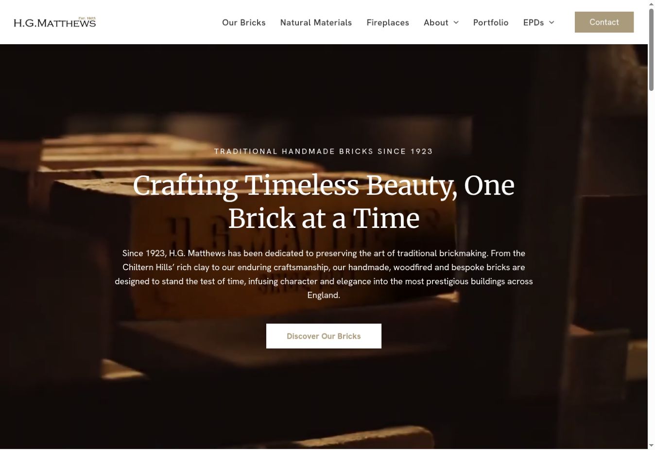
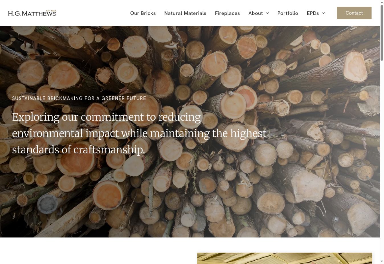
The refreshed homepage, captured from the live website.
THE BRIEF
Make a specialist range easier to explore.
Architects, construction firms and private customers needed a simpler way to find the right products and information.
H.G. Matthews felt its existing website was too information heavy. Visitors were struggling to understand the offering and find what they needed, and the product presentation wasn't doing the range justice.
The brief was to streamline the website while giving the company's heritage, craftsmanship and environmental approach the attention they deserved. It also needed to reflect the quality of materials chosen for high-end new builds and sensitive conservation work.
BEFORE & AFTER
A more focused first impression.
The redesign reorganises the offering around clear product ranges, with more space for the materials and a direct route from the homepage into the bricks.
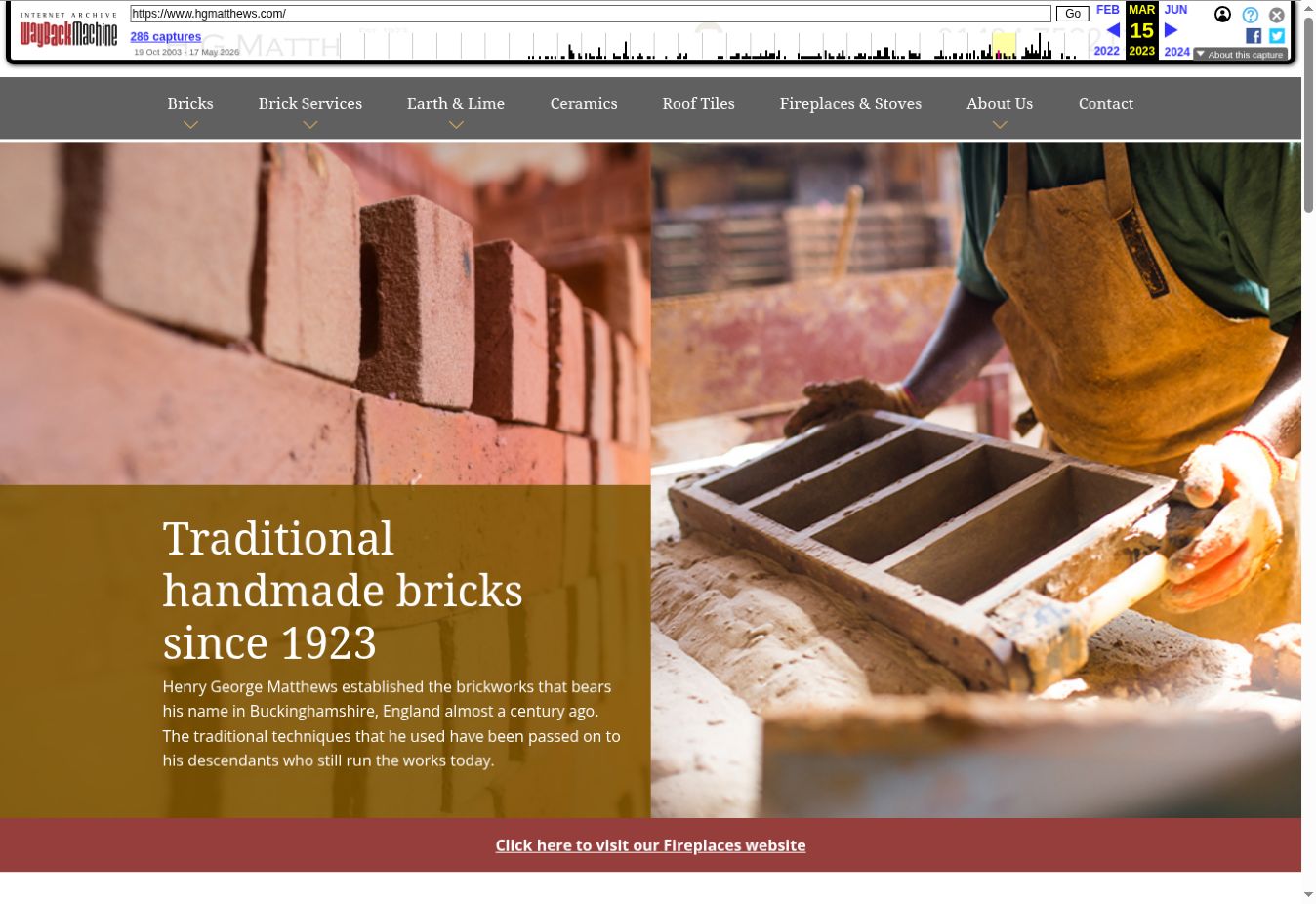
BEFORE The previous website
A broad offering to make sense of
The previous site brought many product categories and services into the main navigation. The brief called for clearer priorities and a simpler journey through the range.
AFTER The current website
Clearer choices from the start
The refreshed site separates product ranges from background information, with a prominent invitation to explore the bricks and a more considered visual hierarchy.
Specialist information still matters. The change was in how it was organised and presented.
I worked on a fresh layout and navigation, streamlining the offering into clearer product areas. Short introductions help visitors orient themselves before moving into the more detailed information.
More prominent imagery gives the materials room to show their colour, texture and character. The layout brings that product presentation together with the company's history and the practical information customers need.
Clear product routes
Distinct routes into handmade, machine made and woodfired bricks, alongside natural building materials.
Product-led imagery
A stronger visual presentation of the materials, supporting the descriptions and specialist detail.
Information in context
Product content, company history and supporting information given clear places within the website.
WHAT MAKES THE BUSINESS DIFFERENT
Heritage and responsibility. Part of the story.
The website needed to explain why these materials are specified, as well as show what is available.
01 / CRAFTSMANSHIP
Traditional skills. A long-standing reputation.
The company's history since 1923, its brickmaking knowledge and its traditional methods are central to the refreshed presentation. The content connects that expertise with the needs of customers working on new builds and historic properties.
Renewable energy and sustainable building materials were important parts of the brief. The website gives the company's environmental approach a visible place alongside its products and heritage, with a dedicated route for visitors who want more detail.
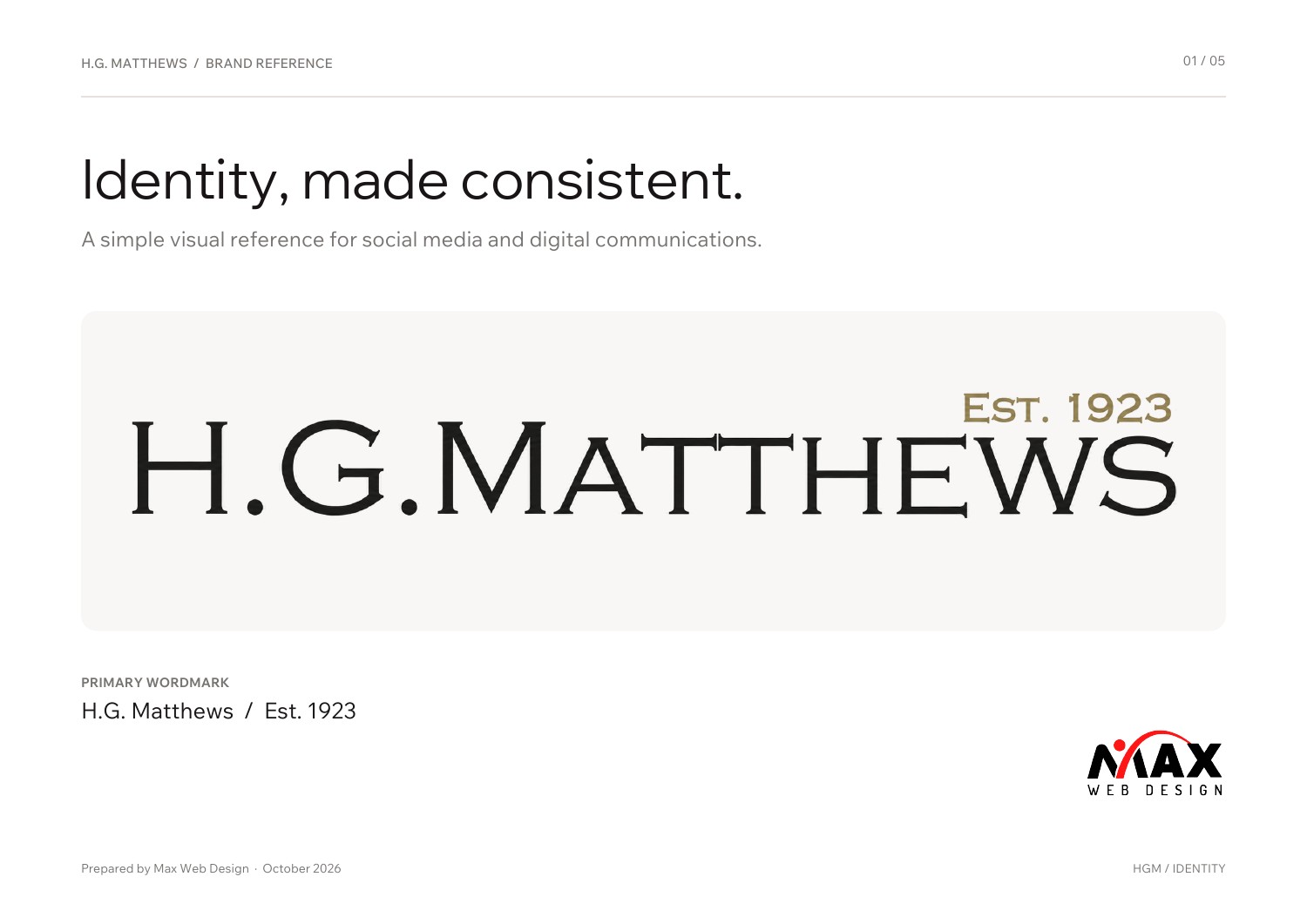
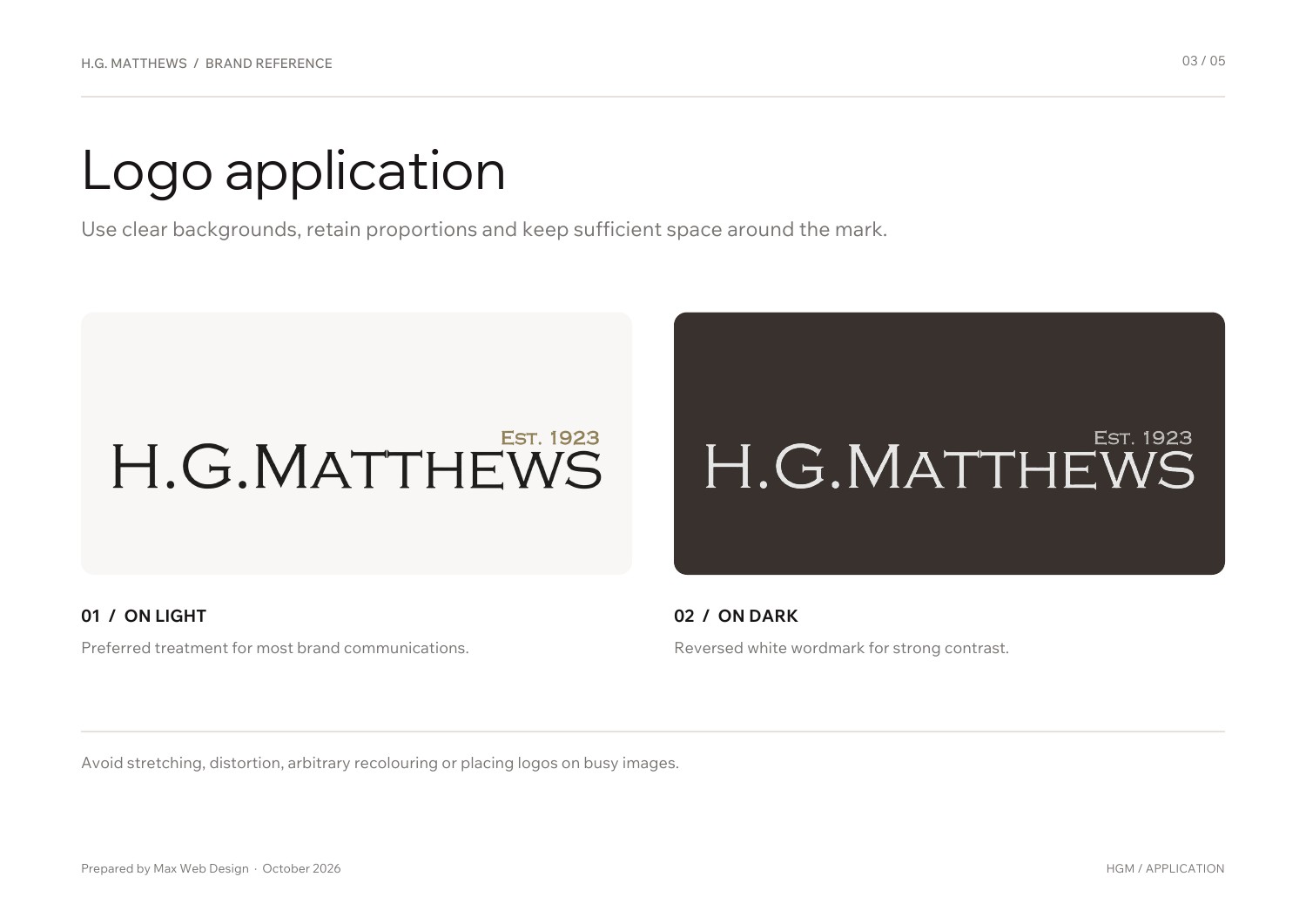
H.G. Matthews already had its logo, but no documented guidelines. Alongside the website, I put together a practical reference for presenting the identity consistently across digital communications and other materials.
The brand reference, prepared by Max Web Design.
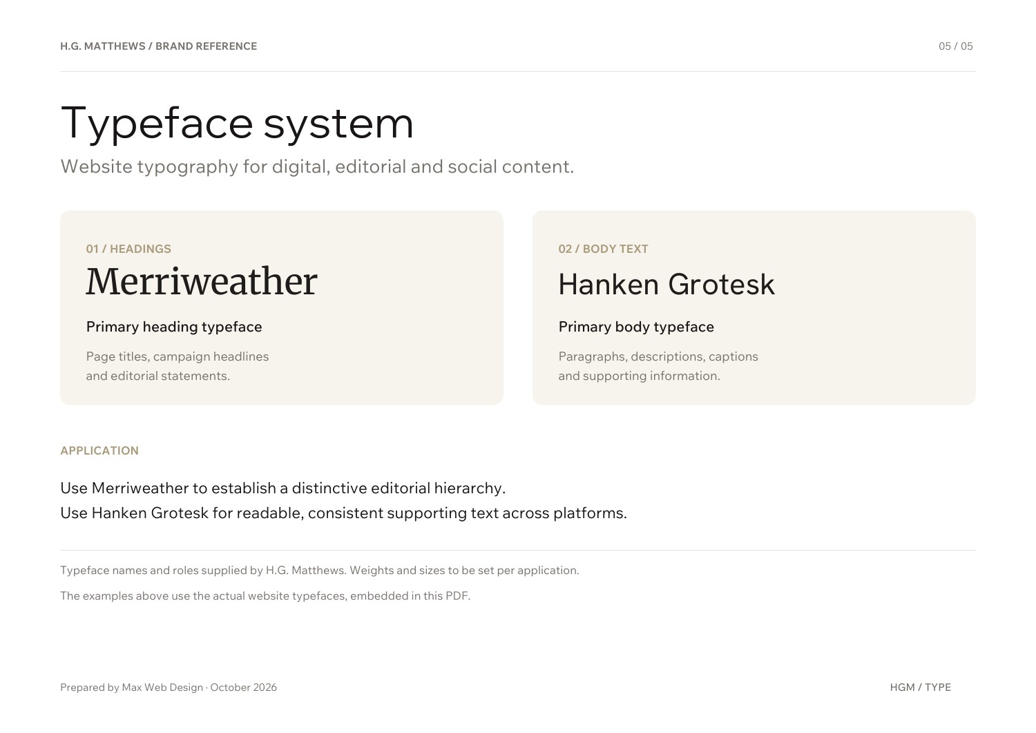
Logo applicationPractical guidance on backgrounds, proportions and clear space.TypographyA defined heading and body-text pairing for consistent communications.
Selected pages from the supplied brand reference. Open any image to see the detail.
MORE OF THE WEBSITE
The pages. The details.
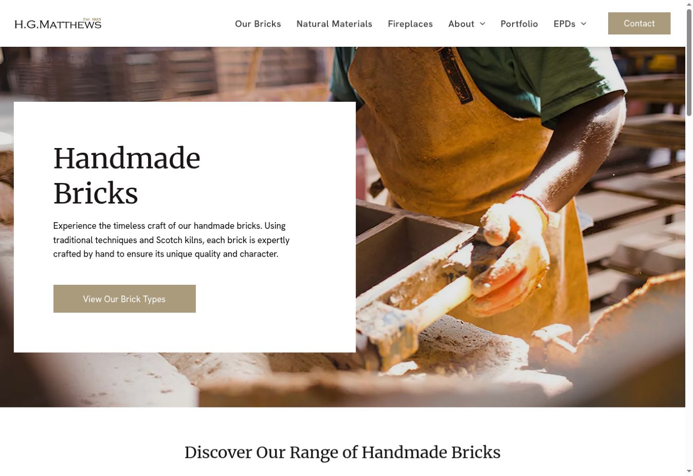
Handmade bricks
A product-page introduction built around the material and how it is made.
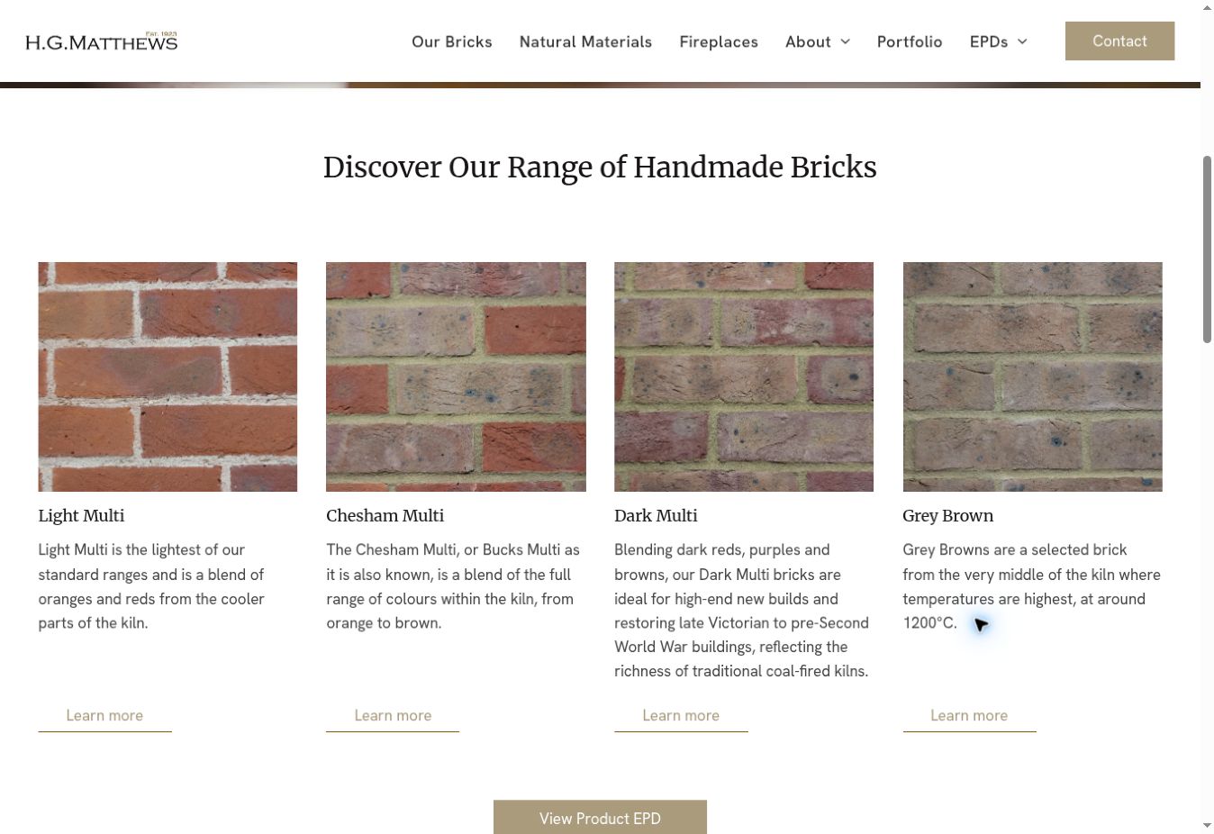
Exploring the range
Further down the product page, colour and texture help visitors compare the bricks.
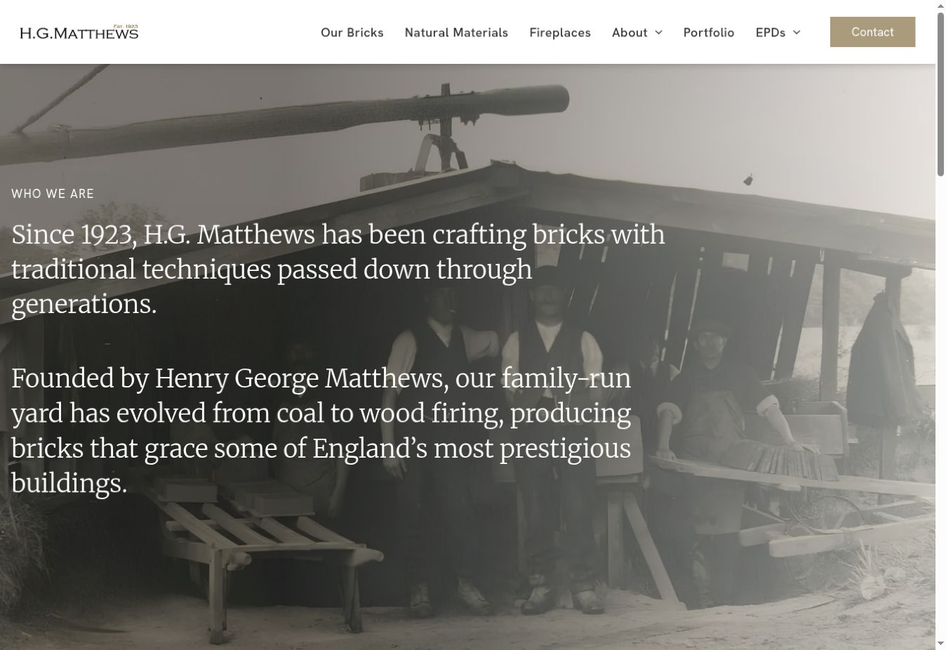
A century of craftsmanship
The company’s story has a dedicated place alongside its products.
The environmental approach
A separate page presents the company’s renewable energy and environmental information.
THE FINISHED WORK
A clearer presentation of a specialist business.
The refreshed website gives the product range, craftsmanship and company story a more coherent structure.
Visitors have defined routes to explore the materials and the expertise behind them. The supporting brand reference gives the team guidance for keeping that presentation consistent beyond the website.
“Max is knowledgeable, professional and very easy to work with. We wouldn't hesitate to recommend him.”
H.G. Matthews Ltd
MORE SELECTED WORK
Bond Fitness
A complete website rebuild for a growing gym, with ongoing hosting and support.
If your website feels cluttered or makes your services hard to understand, tell me what needs to change. We can work out a clearer way to present your business.